
 The above picture comes from Vintagraph, a site (created by the same people as the seriously awesome Shorpy) that compiles old WPA posters. I love this one because the image at first struck me as incongruous to the message, yet at the same time, it does evoke the local through the image of the home, and the state through the image of the factory and tall buildings. Where syphilis comes in exactly I do not know, but the local and state, they're definitely there.
--------------------------------------------------------------------------------------
I am loving this modular storage system. The colours not necessarily so much, it would be nice if they were more in line with those typical to the shipping containers they are based on, but still, they are pretty awesome. I don't know how much they cost, but you can be pretty sure that I would not be able to afford them.
--------------------------------------------------------------------------------------
This here is a beautiful set of transistor radios on Flickr. This guy's collection must be amazing. I've only looked at a small fraction and am in awe. (from the DDC)
On a similar note, I just remembered that a friend told me this weekend that he picked up a part that should complete his repair of my vintage tube amplified suitcase record player. Looking forward to seeing that one again. He's been real awesome in fixing it for me.
---------------------------------------------------------------------------------------
Some pretty great buildings pictured in here. I particularly like numbers 5, 6, 21 (which is actually a part of a complex that I've seen some pretty amazing pictures of), 22, 29 (shipping containers again! I love shipping container housing solutions), 30, 35 (yes, I fell in love like many others did I'm sure at the Olympics), 43, and 50 (Robot building!). That's a lot that I like, I know... There's a second page too, but I won't put you through a list of what I like of that one...
----------------------------------------------------------------------------------------
Jenna tipped me off to this one out of an old issue of Jane yesterday. A couple of years ago, this would have been my ideal website, and I would have loved to be a writer for it. Now I'm trying to cut back on the snacks. I do have some pretty strong opinions about chips though. They even mention many of the same things that I evaluate my snacks for. Another one I've barely touched but would like to get deeper into.
----------------------------------------------------------------------------------------
I'm loving the signs in this small flickr set. The impressive detail on the hot dog, the overload of flash and colour on the cleaners, the impressiveness of the city sign. Good stuff all of it. You really can't go wrong with anthropomorphic cannabalism in your signage, you know? (I think this is via the DDC as well...)
----------------------------------------------------------------------------------------
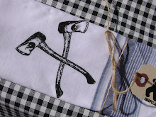
A nice little vintage find on etsy. A beaufiful example of branding and sports if I've ever seen one. The style is just beautiful too.
----------------------------------------------------------------------------------------
I've been seeing a lot of images created out of typography lately (there's a term for it, but I can't for the life of me think of it right now, maybe because I'm distracted by my need to pee...). Some are good, some not so much, but this book looks pretty great. Both the snail and the girl just look so cute, you know?
Speaking of books, we gotta get on ordering some Christmas stuff from amazon so's it gets here on time! It's almost December!
----------------------------------------------------------------------------------------
Oh, and by the way, Seth and Chris Ware were pretty great. Chris was pretty hilarious, in his demure, self-depricating way. Seth was funny too, but a little more pretentious feeling to Chris' constant fear of sounding pretentious. I feel like the ways they said they thought about certain things are quite similar to the ways I do, which is nice to know. Chris had a presentation of a video he creatted with Ira Glass, so you know I was loving that.
2 comments:
Hey Jonny, I thought about you this morning. I received an issue of ReadyMade Magazine and in it was a feature where they asked 5 artists to redesign posters from the Great Depression. I went online to see if I could send you the link and they actually have a link to download all 5 posters. I thought you might like checking it out. http://readymade.com/article/poster_children/
Nice one Sherri! Hooray for being thought of! I love the Simplicity and Art ones.
Post a Comment