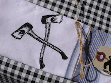
 Yesterday we celebrated Jenna's dad's birthday by sending him off on his bike to parks all over town. I made the logo up there to adorn his shirt, and the sheets that each of us handed him at each park to tell him what to do and where to go. Amazingly the rain held off until the end. Good day.
Tomorrow is another event I did some design work for, the Jane Bond disc golf tournament (aka the best party of the year). There's something I hope we get good weather for. If the weather works out real good I'll be heading up there and camping out tonight. Can't wait!
-------------------------------------------------------------------------------------------------
The other day I received an invitation to join this facebook group, protesting the new UW logo. I was expecting to click on it and see crap. What I saw was something I actually kind of liked. The other thing I saw was thousands of people up in arms about change.
A quick search for a group supporting the change has yeilded nothing, but, thankfully, one of my favourite blogs has posted some great insight on the matter. This paragraph in particular really summed up what I was thinking about it wayyy better than I ever could have:
"The main complaint throughout is that the new logo is not dignified enough and it does not represent the school. But somehow, a crest, like thousands of other crests — who the majority of people don’t know what they stand for anyway — does. Unfortunately this is antiquated thinking. Universities can not get by with traditional crests in today’s über branded environment and, if you look around, most large universities operate with a “marketing” logo and use a traditional seal for boring things like diplomas or the back covers of their catalogues."
And while he does admit that there are some problems with the logo, he also says this:
"But, in application this logo and its extended identity could be very interesting. However, this post and the controversy around it doesn’t have as much to do with whether the logo is good or bad — it’s neither really — but the propensity of students and faculty to cry foul with any change that has been carried out thoroughly by a range of committees. If they respect their university and its values they need to trust their leadership. Not whine about how 12-year-olds could do a better logo. Because they can’t.
Dear Waterloo-people-in-charge: Stick to your plan. Don’t succumb."
Straight up.
-----------------------------------------------------------------------------------------------------
Here's a cross merchandising idea for the TCRG: Rise n' Shiner coffee from the Minnesota Roller Girls. Real nice package design there. Makes me really want that coffee!
-----------------------------------------------------------------------------------------------------
I really hate how much shipping can be. I'd love to buy this print, but the shipping cost is only $1 less than the print itself (actually, you even get two for that price, which is really good for Obey stuff...).
For that matter, this poster, which I would also LOVE to have, combined with shipping puts the price high enough that I just straight up decided not to buy it. So sad.
------------------------------------------------------------------------------------------------------
I guess that's it for now. Lots of stuff to do. New windows are supposed to go in tomorrow (sadly while I am away, so Jenna has to deal with it), and I've got a bunch of stuff to get ready for that before I leave (whenever that is...)


No comments:
Post a Comment