 Pretty much the best thing that publishing companies keep doing is releasing new and impressive covers for books I already own. Sometimes, a cover redesign is actually pretty terrible (also, covers based on the movie based on the book), but much more often lately, I have been impressed by companies' choices to work with great designers and illustrators. This whole series really rises to the occasion in that regard.
Seriously, this kind of thing makes me want to re-purchase books I already own. At one point, if you had asked me what my favourite book was, I would have said White Noise, without a second's pause. It's been awhile now, and it's time for a re-read to see where it sits, but I'd so much rather read the version above than the one I currently own (actually, I probably wouldn't want to read the new version, because I wouldn't want to hurt it). I've actually been tempted for years to trade it in for this one, which was already clearly better, but this new one takes the cake!
I've been tempted by this one in store before for sure too.
And this is a book I've always questioned Jenna's ownership of, but now I want to run out and buy this version!
This one would be hard to pass up too...
------
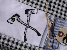
This was super-exciting for me the other day. When I started into that post I was thinking "Hey, I made a packaging related show poster, I should send it in!" And then BANG, there it was, on a blog I really enjoy. Really made me feel good. Even if I'm not that proud of that poster anymore...
------
This is an impressive little piece of focused self-promotion. Seeing it inspired me in a poster I had to make recently. Not that I hadn't seen the multi-media background, colour cut out overlay before, but I kept looking at that piece and couldn't resist making this:
 ------
This barbershop/railway museum might be just the thing that would get me to go back to having someone else cut my hair. You know, if it wasn't in Northern Ireland...
------
Font memory game? Yes. I feel like I've seen something like this before, but I don't know where. I do believe that it was someone's self-promotional piece though.
See what I'm saying about self-promotion? Awesome stuff lately, I'm always talking about someone's work for themselves!
------
Adorable and clever pet food packaging. Seriously, adorable.
------
Here's an interesting idea that I've actually kind of thought of before. For the right price, I might consider buying one. The question is, how different is it from just having a plant in your room?
------
If anyone in Toronto can get me one of these posters, I would be super grateful. Seriously. I wonder if you can get them from the zoo? You know I like my bears...
------
After yet another purge, my pile of things to share is getting smaller. Too bad it also tends to get bigger every day or so...


No comments:
Post a Comment