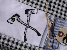
 After feeling like I've been lagging on poster work for awhile, I busted out 3 posters in the last few days, so that they can get up for the weekend. Feels good to be productive. I'll get them up on gigposters sometime soon.
------
Don't forget, Layer Tennis is tomorrow. Someone mentioned that last week they couldn't figure out how to get to see each volley. If you click "The Match Preview" it'll take you to this page, which is the page for tomorrow's match. As the match gets going, keep an eye on the numbers on the bottom right hand side of the box, as they'll become links for each volley. Check it out on the page for last week's match here.
I'm so excited that some of you also seem interested in watching Layer Tennis!
Check out an in depth re-cap of last week's match by the competitors here.
I know I said last week that I thought Felton would win, but in the end, I was won over by Vinh's volley's 6, 8 and 10 (which I mostly loved, minus a thing or two. Love the rectangles that become the previous volleys, and, though unsubtle, I think images of the Catacombes are impressive).
------
Jenna's mom's friend Ellie sent me this link this week. I remember hearing about someone doing really impressive Etch-a-Sketch art a few years ago, I wonder if this is that same guy? Cool stuff.
------
So much minimal re-imaging of book cover and movie poster art these days! This Stephen King set really fits into both groups. Trying to pick a favourite I managed to cull it down to either Carrie or The Shining. Carrie so nicely sums it up in one bold, simple image, The Shining does that, but then makes the image complex. Both awesome. You should just check them all out though, because the Firestarter one, and the Misery one are pretty cool too. And I dig the trees in the Stand by Me one.


No comments:
Post a Comment