
One stress in our life is done, now we just need to get the kitchen worked out. Which, actually, I think might happen. Even if the manufacturer still has to make the floor we want...
I've been hoping to come back with something unique and exciting, but instead it's more purging of my reader. Which does yield some exciting stuff, but somehow feels less than exciting, you know? Hopefully it's just me.
------
Department of Eagles video designed and co-directed by
Marcel Dzama. I started listening to Department of Eagles this summer, and definitely enjoy it. This track is a stand out for sure. And I've loved what I've seen by Dzama in the past.
Truth be told, I only watched about a minute of this and then had to share it. I suck at watching videos that other people post. I will leave this one unread and then take forever to go back and fully watch it. The funny part of that is, I have a bunch of videos I've seen that I'll be sharing with you soon, and expecting you to not do what I always do, and actually watch them.
------
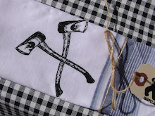
Cutest headphone jack splitter ever? I think so.
------
Periodic Table of Typefaces? I'll take one! (okay, really, I'll think about taking one... do I really want to pay $22+ for it, and do I have anywhere to put a largish poster? I think I might, and I think I do. So maybe I will take one... We'll see.)
Lino-cut printing with a steamroller? Yes! (Seriously, watch the video. It's pretty impressive!)
(These were both from
FPO [For Print Only] which is a pretty awesome blog about, not surprisingly, printed materials. I love it because they break down the cost, materials, etc. Quite interesting.)
------
Cool bird prints. These are probably making the rounds pretty good. I saw them on
Grain Edit and LOVE them. There's a whole lot of Charley Harper influence in there it looks like. Some highlights for me:
1 -
2 -
3 -
4. A few of them together would make a nice little collection of prints somewhere. Where's the red-winged black bird though? Give me one of those, and I'm in.
------
The
classic CBC logo gets ripped off! Not
once, but
twice!
------
Beautiful abstract tattoos. I can't believe how much they look like actual paint. Interesting idea, bridging the "real art" vs. body art gap. I'm also the birds in the chest piece in the "modern" section of
the artist's website. (Sorry, I'd link direct, but it's flash...) Really nice stuff.
------
So, I have to admit, I never was a massive fan of Where the Wild Things are. That's not to say that I didn't like it, just that I wasn't huge into it. I never owned it. I bet if I had I would have loved it, but I never did. I did love the
Little Monster books, and other weird stuff by Mercer Meyer.
So anyway, I had to admit that, in order to say that I am really excited about the upcoming movie version of Where The Wild Things Are. Everything about it looks awesome, exciting, and magical. I've been reading
the blog connected to the film, and that's become a part my excitement too. It really highlights the tastes and ideas of the filmmakers and what has influenced them and their movie.
As an example, here's what they think of people tagging their billboard:
"A better shot of our new favourite billboard" &
"Billboard". I love the text in the second one (which was actually the first one), posted by Spike: "Finally! I’ve been waiting to see one customized. We should have a contest for the best altered billboard…" They really appreciate that that is someone else's art and work interacting with their own.
Anyway, great blog, great seeming filmmakers, hopefully great movie.
------
I guess that's it for now. Still 36 unread items in my reader, but better...
I'm loving this weather lately. Though it's making me wish we were back in New England, since we were there this time last year, and it was super grey and rainy the whole time (as you can see it was when we visited the top of Mt. Washington in the picture above). I miss it for sure.
The bad part about the weather? We were hoping to get in a game of disc golf today...


