Showing posts with label stapler. Show all posts

26.2.10

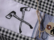
EXCITED. Jenna found this on etsy today, and I bought it instantly. I've seen one on ebay once before, and was sure I'd never see another one again.
------
I don't know about you, but we've been watching a lot of Olympics around these parts. I'm glad it's almost over though, 'cause I'm getting real sick of how much filler there is in the coverage.

Obviously, a big part of any Olympics is the graphic design. This is a pretty cool little video about Olympic pictograms. I have to say though, I really don't agree with it's assertion about the two good sets since 1984. Both sets from '68 and obviously the Munich '72 set are awesome. And pretty much nothing has been good since then in my books.
------
Loving these Bacon Takedown images. Mmm, bacon. (thanks baconbaconbacon)
------
Here's a nice classic Sesame Street bit, featuring some kids learning a bit about letterpress printing.

Speaking of letterpress, if you don't know much about it, there was recently a little overview of one person's printing process over on Design*Sponge.

17.12.09

I keep going back to this Audi image. Stark and simple, but stunning. The confidence it exudes is amazing. So much different from so many car ads. (Thanks to Grain Edit for linking to that one)
------
Film guide is done. We're never done this early in the month, and it's going to make this Christmas a lot more relaxed. It was a stressful time to lock it down so early, but totally worth it.

Our living room is finally painted, and the Christmas tree is up. It feels so much more like home now in there. And it only took like 6 months! Dining room is painted, but will be painted again this weekend. The colour we picked was just not quite right...
------
Here are some tabs I've had open for awhile, either to look at again (and again), or to share:

Ampersandwich tee - Pretty funny. Not quite totally doing it for me, but enjoyable.

French Paper Company and Charles S. Anderson Design - Nice promotions!

Cabin and Cub desk calendar - I love the idea and look of calendars, but I've never been big on using them. This one almost got me to buy it. It's pretty great, and bears!

Swingline staple gun & box - Jenna sent me this one, and I would LOVE to own it. Once you add in shipping though, that cost is just totally impractical. The label on the side in picture 3 is pretty great.

Baby Kermit Glass
- Another one from Jenna. SO CUTE.

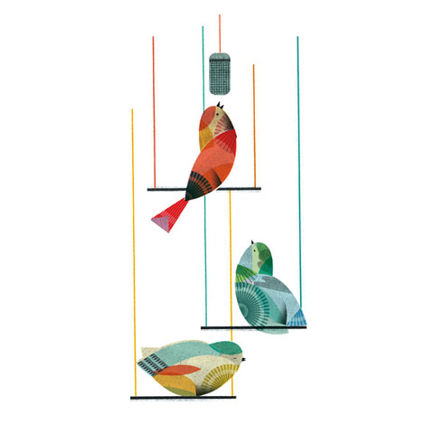
Lotta Nieminen Birds - Love so much about this image. Grain Edit featured a couple of her pieces. All are good. This one's the best though.
------
Few, my Firefox is way slimmer now! Hope you enjoy some of that stuff.

20.3.09


Jenna and I went to Collingwood last weekend, and we got to drive through the Melancthon EcoPower Centre. Exciting. According to this list on Wikipedia, it seems to be the biggest wind farm in Canada. I do love me a wind turbine. Someday I really want to see one of those tightly packed desert ones.
-------------------------------------------------------------------------------------------
Ever since I first saw one of their ads in the paper (I cut it out, and I think I still have it...) I have been in love with the Porter Airlines identity. Turns out other people are too! I was super excited to see one of the primary people behind creating that identity got interviewed on Design Sponge. Turns out the guy is only a year older than me! But at least he seems to love the raccoon in the ads, and the things he gets up to as much or more than I do. Seems to really appreciate what he's involved in, you know? Anyway, interesting interview, with lots of great ads I haven't seen before. What a treat!
--------------------------------------------------------------------------------------------
Mario Bros. on the theremin!

Which reminds me, we also saw Video Games Live! last weekend, which was pretty cool. What wasn't cool were the kids behind us who WOULD NOT SHUT UP THE WHOLE TIME. Seriously. And it's not like they were saying anything interesting, just "I have that game," and descriptions of what happens in said game. Their loud, shrill voices just cut through everything and really took away from my enjoyment of the night. Grrr.
---------------------------------------------------------------------------------------------
Speaking of Armin Vit earlier, here's something great off of his site, Brand New: the new Hudson's Bay Co. logo. I love it. The revamped coat, bringing back the boldness of the lines that are so prominent in thier history, and became so lost in the old logo, the typface, the return to the full name vs. HBC. All of it, great.
---------------------------------------------------------------------------------------------
Aside from my obvious love for the staplers, one of the things I love about Stapler of the Week is the writing/mentality of blogger Chad Lemke . Here's a nice little gem from this week's post: '"It may be foolish to wonder at who or what vocation this design was aimed, but it's what I think about in my spare moments. I'm always asking the question, "What would you fasten with this stapler?"' I just love the way he looks at these things. One of the best blogs around.
---------------------------------------------------------------------------------------------
The evolution of the Batman logo. Nice.
---------------------------------------------------------------------------------------------
A new site to be pumped about: The Art of Manliness. Lookin' good. Excited to get more into it.
---------------------------------------------------------------------------------------------
Saw Coraline in 3d last night. Awesome.
Seeing Watchmen in IMAX on Sunday. Excited.

27.1.09

Had a pretty great weekend that consisted of 3 days of antique markets. Spent about 1 hour on Friday at the St. Jacob's antique market (with its big sale!) before it closed on Friday, went back on Saturday to finish up in about another 2 hours, then went to the southworks one in Cambridge with JT's parents. Amongst other things I scored the above stapler (the Apsco A9), one of these pretty sweet salt and pepper shakers, and we started assembling a pyrex bowl set. Spent a lot of time looking at sets other people had put together, but realized we could get something where every bowl is in better shape, and is exactly the colour we want if we buy it all piece by piece (if possibly a little more expensive). Jenna has a radar for spotting pyrex bowls, even if they're hidden behind like 8 other things and she has to move something big to get to them. Impressive. She spotted my stapler too, after I had walked right past it.

Solid weekend.
----------------------------------------------------------------------------------------------
Pretty badass shirt... Can only find a version for sale that I don't like nearly as much.
----------------------------------------------------------------------------------------------
Also, we've started papercrafting. More on that another time.

17.9.08

This here book reminds me of a nice little timewaster we once made up called the "nipple/phallus game." Basically, stuck with some friends with some time to waste, the goal is to look around your surroundings and point out things that either look like a nipple or a phallus. When it comes right down to it, you can argue that many many things in this world can look like one or the other. This book seems to embody that idea pretty well.
----------------------------------------------------------------------------------
Definitely keeping an eye on this little gem on ebay. The shape reminds me a lot of my favourite stapler, the Swingline Cub. Definitely looks like just a knock off, but as I love that shape, I'm not arguing! Oh, and I LOVE that packaging! Definite selling point there. Hope it doesn't go for too much!

I wish this hadn't gone for so much, woulda been nice to pick up for sure. Combining my love of staplers (the Swingline Tot, so cute! With a mention of the Cub too!) with my love of letterpress (and halftones...). Awesome! But too much for my blood right now...
----------------------------------------------------------------------------------
I've been pretty into illustrated alphabet sets lately, and this here is a beautiful set of vintage matchbooks that come together as a set. It's a little weird if you think about, since illustrated alphabets are typically kid-related, and matchbooks are typically very not kid-related, but you know, whatever. You can't argue with nice design. I especially love the fact that they're in Spanish, so instead of 'T for Turtle' you get 'G for Galapago.' Would love to see more shots, closeups of each would be nice, but just getting to see them is pretty great. Not surprisingly, I love the Owl (or Buho, if I'm reading correctly.) Thanks GrainEdit!
----------------------------------------------------------------------------------
On a personal note: I finally made a header for this blog! I hope you like it!
----------------------------------------------------------------------------------
On a much too personal note: frustrated with my seemingly endless sinus issues, I've decided to try out "nasal lavage." It's weird, but I'm pretty happy with it so far, and excited to see if it makes things better in the long run.

18.8.08


Today was Marc & Celene's "baby fiesta." That's the poster I made for it up above. Definitely an enjoyable time. Celene's mom got me to dump a big pail of ice water on Marc. I ended up bonking him on the head too though, resulting in a playful scolding from Marc's mom.
---------------------------------------------------------------------------------------------
Managed to squeeze in the viewing of a couple of doc's this weekend.
The Tri-City Roller Girls are hosting a special screening of Hell on Wheels at the Twin this Thursday, but the dvd came in on Friday, so I borrowed it to run a "test screening." Good movie. Interesting stuff about the rebirth of the roller derby. Gotta love the Texans for that (amongst other things). The derby seems to be a great thing for a lot of the girls who play it, and you can't go wrong with that.
Yesterday and today I watched Punk's Not Dead, which was pretty good too. It never really judges about just what punk is or is not these days. Some people in it do, but the film seems to give respect to what the newer bands are doing.
2 films in one weekend! a far better showing than the 3 weeks or so it took me to get through Crumb. Which was not because it wasn't good, but moreso that I just didn't seem to have the time to really sit down with it, or when I tried to, I was too tired. The movie is really interesting in that it almost becomes more so about the mental states of his two brothers than about Robert Crumb himself.
---------------------------------------------------------------------------------------------
Might have to buy this one. Jenna found it. I already own basically the same model in black, but it doesn't have the clip, or the staple remover. Looks real nice in green too. I think I paid $.50 for the one I currently have 'cause it was jammed when I found it at ValueVillage and I convinced them it was broken. Love the fact that it locks shut for travelling. Clever.
---------------------------------------------------------------------------------------------
Finally did some planning for our New England trip. Gotta make sure I can get the days off. Oh, and finish planning. And book some rooms.
---------------------------------------------------------------------------------------------
Seems to be some pretty great ingenuity behind this bike is pretty sweet. Solar panel wheels, genius. (via The Canadian Design Resource)
---------------------------------------------------------------------------------------------
Well, I was hoping for daily on this, but I missed two. Still better than my livejournal has been for a long time...